
test
Welcome to Intertwine
From Data To Insights In Seconds
1. Why we exist
Dashboards shouldn’t take hours or a pricey BI license to build. We started Intertwine because analysts, founders, and operators kept telling us the same story:
“I export a CSV, wrangle it in Sheets, drag-and-drop in a bulky BI tool, then email screenshots that go stale overnight.”
So we flipped the script: ask a question, get a chart instantly. No viewer fees, no drag marathon, no lock-in.
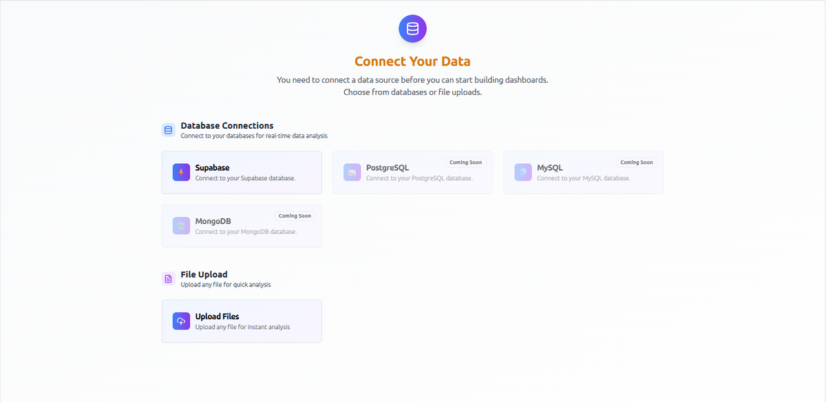
What Intertwine lets you do in under a minute
Connect or upload — Supabase and Files today, Snowflake, Stripe, Notion, Google Sheets, and 1000+ other sources on the way.
Ask — Supporting simple everyday questions but can also handle the complex ones too.
Simple:
“Show total revenue by month as a line chart.”
→ Intertwine groups your data by month and returns a crisp line in a heartbeat.
Complex:
“Bucket remote_ratio into Remote, Hybrid, and On-site; then heat-map the average salary_usd for every industry across those buckets.”
→ The engine auto-creates the three location buckets, calculates industry-level averages, and renders a matrix heat-map—so you can spot, at a glance, that fully-remote FinTech roles pay roughly 12 % more.
Whether your question is a two-liner or a two-step pivot, Intertwine handles the heavy lifting and hands you a ready-to-share chart in seconds.
See — bar, line, violin, heat-map, animated bar-race—auto-selected for clarity.
Save & share — build a live dashboard; anyone with the link sees the latest data, no paywall pop-ups.
Stay current — paid tiers auto-sync every hour (or faster) while you sip coffee.
You get insight without modeling tables, memorizing SQL, or begging for BI seats.
Who gains the most
Founder / GM — Hunting through exports the night before investor calls.
Outcome: build a KPI dashboard in two prompts and drop the live link straight into the deck.
Ops or RevOps lead — Waiting on a data team for basic funnel views.
Outcome: create self-serve charts that refresh hourly and make same-day decisions.
Marketer — Hand-copying campaign stats into slides.
Outcome: merge Google Sheets and Ads data, then visualize it in three plain-English sentences.
Finance / Accounting — Drowning in ledger rows with no time for visualization.
Outcome: generate cash-flow and spend charts that stay up-to-date with every close.
Whether you’re a seasoned analyst, a small-business owner, an executive, or simply someone who loves turning numbers into insight, Intertwine is built for you.
A Sneak Peek
Prompt
2. Chart appears
Dashboard share link — paste in Slack; your teammate sees the live version.
No hidden fees, no “viewer license” roadblocks—just instant clarity.
How we’re different (and why you’ll feel it)
- Ask in plain English—no dragging required.
Intertwine’s chat-first interface turns a question like “Show salary spread by role” into a chart in seconds. In tools such as Tableau or Power BI you still drag fields onto shelves, tweak marks, and often Google a tutorial before anything useful appears. Intertwine helps the whole business see what matters. - Zero viewer tax.
Anyone with your Intertwine link sees the live dashboard for free. Comparable seats cost $15 per “Viewer” in Tableau and $10 per user for Power BI Pro—a hidden bill that balloons the moment twenty casual stakeholders want a peek. - One workspace for every metric.
Intertwine pulls sales from Stripe, traffic from Google Analytics, and uptime from your status API into a single view. Datadog stops at ops data; Tableau and Power BI ignore logs and traces. With Intertwine, finance, marketing, and engineering finally read the same scoreboard.
Where we’re heading
- Stripe connector (beta next month) for real-time SaaS metrics.
- Agentic alerts: “Ping me if churn > 5 % week-over-week.”
- Template marketplace so you can clone a best-practice dashboard instead of starting blank.
Try Intertwine (it’s free, painless, and viewer-fee-free)
Open the Playground →
Upload one file, ask one question, and see your first chart in seconds.
Questions, edge-cases, wild ideas? Drop them in chat—every prompt makes Intertwine smarter, and every chart gets you closer to data-driven decisions without the usual detours.